| View previous topic :: View next topic |
| Author |
Message |
demoralizer
ANBU Leader
Joined: 23 Jul 2009
Posts: 196
|
 Posted: Fri May 21, 2010 10:02 am Post subject: Characters of ND20, of my universe. Posted: Fri May 21, 2010 10:02 am Post subject: Characters of ND20, of my universe. |
 |
|
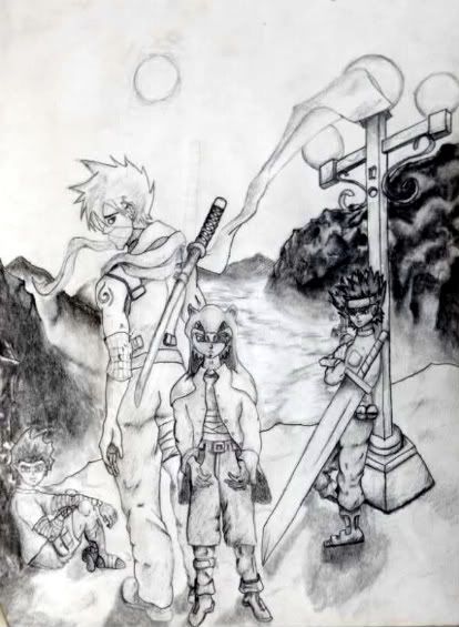
(Reminder: This is a photo taken of a picture. External light probably effected it somewhat as I don't have a camera.)
Very Front: Botosan (genjutsu master) Age: 10
Right: Hyaki (Taijutsu Master) Age: 15
Left: Morasai (Ninjutsu specialist, Suiton) Age: 12
And of course you can recognize Kyashi, he's the Jounin Teacher.
Let me know what you all think.
Currently, I am taking requests for characters. Be advised though, I have no option for coloring. Usually I use watercolors, acryllic, or digital but have no access to any of them. Requests should include the following:
Characters Name.
Characters Clothing.
Character estimated Weight.
Characters height.
Characters build.
Characters Age.
Characters physical description of attributes. (Any funny features, like big eyes or a big nose, deep cheek bones, hairstyle, haircolor, eye color, skin color. I ask for color of things because light effects each color differently.)
Characters footwear. Sandals, boots, or other type of footwear.
Special Notes: Background, or no background. Mood of the character.
If you include a background, let me know what you would like, be as descriptive as possible, and I'll do my best.
<3 |
|
| Back to top |
|
 |
|
|
ultima22689
Kage
Joined: 15 Apr 2008
Posts: 285
|
| Posted: Fri May 21, 2010 1:06 pm Post subject: |
|
|
| SWEET. Your art looks pretty good, i'll send in a request soon myself. |
|
| Back to top |
|
|
demoralizer
ANBU Leader
Joined: 23 Jul 2009
Posts: 196
|
| Posted: Fri May 21, 2010 1:25 pm Post subject: |
|
|
I've been working with manga for about six months now. It's coming along alright. The problem you face is when you draw in backgrounds, the contrast seems to take the picture over and it loses its anime effect. I think manga artists use too little contrast and shading in most manga's (on the comic strip) because sometimes the picture looks very sloppy and it's hard to distinguish. On a flip note, on TV or once it's animated... The color replaces the contrast levels making it look very neat and organized. As you can tell from any of my drawings, the backgrounds sometimes break the mood of the image. I didn't intend to make this image as a night time image, but due to the contrast I added in the light post, repositioned the moon (which was the sun on a very murky day), and came out with what I have here. I'll await your request.
Obvious mess-ups on my picture above for the keen eye: The wrist band, I forgot to checker it in like in previous pictures;
the hilt of the zamabanka (Big ass sword, may have used the wrong word for that, lol), the picture as I stated was meant to be a day time and it was going to be leaning on a wall. I had drawn it in when I decided that the setting was incorrect and the contrast was too great to look like a day time image. So rather than erase, I drew the light post. Thing with it is... What is it leaning on? I used drop shadow to make it look as if it's leaning back and toward the light post and leaning on it there.
All the wraps don't have lighting or contrast effects as an inner-shadow. It's hard to tell they're wraps. |
|
| Back to top |
|
|
Athildur
Sexually progressive Valkyrie
Joined: 27 Jul 2005
Posts: 3197
Location: Netherlands
|
| Posted: Fri May 21, 2010 7:23 pm Post subject: |
|
|
Lookin cool. One remark: Botosan's feet look incredibly weird. I'm pretty sure they're not supposed to be pointing down like that. It almost looks like he's wearing heels now...
At the same time, Hyaki is leaning against that post, and yet he's standing *below* that post. It's riveting! Maybe I'm wrong on that one, but it still seems slightly off.
But the drawing technique etc seems solid, I like it  . .
_________________
Oy, this is going to be troublesome *sigh* |
|
| Back to top |
|
|
SirShadow
Biffu Aroi

Joined: 10 May 2009
Posts: 2654
|
| Posted: Fri May 21, 2010 8:34 pm Post subject: |
|
|
| Athildur wrote: | | At the same time, Hyaki is leaning against that post, and yet he's standing *below* that post. It's riveting! Maybe I'm wrong on that one, but it still seems slightly off. |
Agree'd his feet should be on the same plane as the bottom of the pole, at least from the angle his feet are pointing... |
|
| Back to top |
|
|
demoralizer
ANBU Leader
Joined: 23 Jul 2009
Posts: 196
|
| Posted: Fri May 21, 2010 9:10 pm Post subject: |
|
|
Thanks for the feed.
Botosan's feet do look a bit odd, but the picture is drawn to be looking down slightly. He is standing a foot and so off inches in front of Kyashi. You can tell from Kyashi's feet, which counter gravity to Botosan's... the angle of the image is upwards looking down.
For Hyaki, his posture is leaning back and to the right (I did this to help the sword look as if it's leaning back and to the right). This wasn't intended at first, but like I said, I had to change the contrast of the image and added the light post later on. I should have repositioned his feet, but they were already drawn in darkly and set down, so I didn't want to smudge or leave pencil press.
If you look above the sword on Kyashi's back... it looks as if something feint is sticking into the air. That was his old sword which I decided to change at the last minute so erasing the old one left pencil press in its wake and I had to redraw Kyashi's right trap area and some of the scarf. This rarely works out exactly how it was originally drawn and doing it too much can ruin the picture. I avoid it if I can use some other technique to alleviate it to make the 'feel' of the image remain consistant.
:/ In this instance for Hyaki, I was hoping the drop shadow would be a further indication on how he is leaning against the pole. Only his right shoulder is pressed against the pole from how I meant it originally. The pole isn't even supposed to be in the picture... A late comer to this party here. LOL. Something had to be done though or the picture was ruined.
All that being said, the observer is never wrong. Usually the artist, if he finds himself in a situation he needs to explain, didn't portray the image as he should have.
I appreciate the compliments on the drawing technique and everything Athildur, when I finished this image I felt as if I had come quite a way since my last pictures with manga so far. Perhaps my next endeavor will be better, I'll do something with less contrast and a lighter background. Cheers. |
|
| Back to top |
|
|
|
|
|
|
You cannot post new topics in this forum
You cannot reply to topics in this forum
You cannot edit your posts in this forum
You cannot delete your posts in this forum
You cannot vote in polls in this forum
|
Powered by phpBB © 2001, 2002 phpBB Group, Theme by GhostNr1
|


